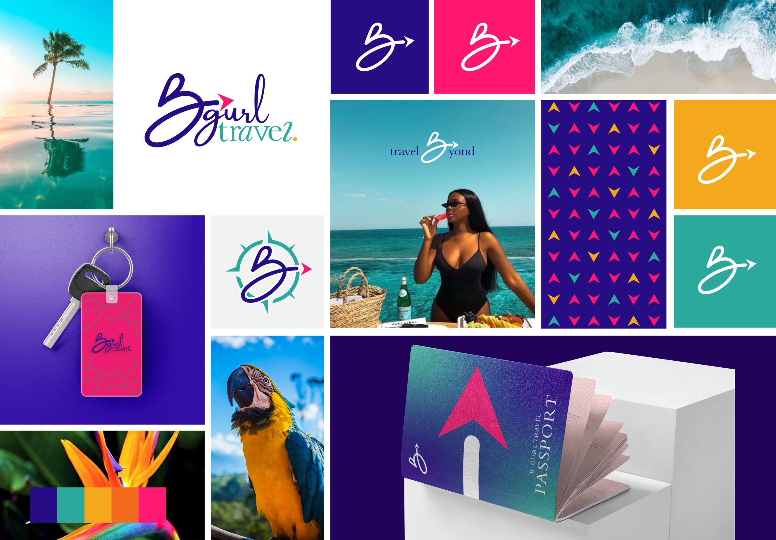
B Gurl Travel
“Something with energy. The new logo design should really pop.” Welp… we think we nailed this one. BRANDilly was tasked updating the look and feel of B Gurl Travel’s identity and logo. As a travel agency specializing in luxurious getaways, we were careful to choose a color scheme that was bright and representative of the exotic, tropical destinations their clients’ frequent.
The flowing “B” icon was designed to show movement and includes symbols commonly associated with travel and cartography.

